What do you think of my magazine?

Monday, 3 May 2010

Evaluation

Throughout this project I have been planning a production of work leading to my final music magazine. I have learnt to analyse and compare magazines and by using these skills and using it upon my own drafts in the preliminary task. I have also included analysis and research on other magazines based on background companies and the different styles to use as a guide in creating my own. A typical magazine includes big, vibrant fonts, a attractive central image with various anhorage texts included and buzz words. I used these features in the making of my product in style of a real magazine. I have included a list of planning and research methods to give ideas of what the music product be based on and include.

In what ways does your media product use, develop or challenge forms and conventions of real media products?
In my music magazine it includes both challenges and uses of forms and conventions with features of real media products such as the style and features of common music magazines including a central image and a big and bold title that stands out. In representative of my product it is inspired by Kerrang. By looking at the front cover it shows the title of the magazine is large and bold with a bright colour that stands out as an attraction to the audiences which follows a common feature of real related music magazines. But a feature that differs is the phrase/slogan used above the title as an introduction line to the main attraction of the title. I thought this could be an extra feature to sell the magazine. The title of the magazine, Pulse, was thought through by researching various music magazine and taking ideas from theirs. Pulse was thought of from the idea of the way music can make you feel. As my genre to be punk/rock, the style of music is more strong and loud and could get your heart and mind excited which is where Pulse came from. The more entertaining the music is the faster your pulse is racing. I also thought through the style and syllables of words that could attract readers of which usually magazine will rely on as their main aspect to get readers to buy. A single syllable word can catch more attention than making your title long as it wont exactly shoot out to them quickly, which was also how I thought of the title of my magazine, Pulse. The front cover of my magazine includes a central image of the main attraction in style of the type of genre of the magazine which is popular with real media products as well as in general, as the product’s centre of attention and also the written style of the way my article is presented onto a double page spread instead of in collums. These are also features that I used in relation to real music magazines.

How does your media product represent particular social groups?
As shown on my media product, particular social groups such as punk/rock music listeners are represented through the colours used and the style of images that has been taken. The name of the media product could also be another feature that represents the genre of the product to suit those groups that has interest in a specific music area such as punk/rock. The artist used such as the LA GIRLS and TRIPLE-EX are recognised to be at the age of 18+ which means that their music are mainly addressing to age groups from 13+. This also means that the music and information of which the media product includes will be relatively the same styles of music listeners are interested in these days.

Who would be the audience for your media product?
The audience for my media magazine are for those that are interested in punk/rock music and teenagers from the age group of 13-19. The way these are recognise are by the design of the magazine with the colour used of just red and black which are seen pretty dark as it represents the genre punk/rock. The layout of the magazine is quite straight forward and easy to understand what it is about with basic text and by the way it is presented. It is intended for no specific age group but usually teenagers from 13 subscribe magazines. The central image mainly stands out the most to readers, are of two young girls who looks at the age of 18 represents that the magazine are catching audiences of young readers.

How did you attract/address your audience?
By looking at my media product, the way it attracts audience can be seen from the title as it’s big and bold but the disadvantage of the title is that it is situated where it wouldn’t be the main attention to readers, at the bottom of the page. When readers take a first look at the magazine they wouldn’t be attracted by the title straight but the central image, which saves the magazine from being noticed as the image gives a quick attention to their act and the question of “who are they”. This creates an intrigue attention to the readers to read on inside. By viewing this I would decide to change around a few features to make the magazine more noticeable to become a more popular product.

Who would be the audience for your media product?
The company I would choose to publish my magazine would be the Bauer media company because it’s the second biggest magazine publishers in the UK and the style genres of their products are more related to the product I’ve created. With this known, it seems as though it could be recommended as the company that suit well with my magazine to distribute. By completing research of Bauer media, my attraction found was about their audiences who are music lovers is also a bonus for my product as it is a music magazine that I’ve made. Choosing Bauer media institution would also be an easy way to publicise my magazine via internet as it could be more convenient to readers to receive updates and by doing this it would also increase profit and popularity rates which shows success.

What have you learnt about technologies from the process of constructing this product?
Throughout the making of my product I have learnt a few things and more advanced from what I first knew from the technologies I’ve used. During the process of constructing my music magazine I’ve used software such as Adobe Photoshop to design the magazine and from my previous experience with this software it has now improved more than from what I use to know from the basics. The skills I’ve learnt from just playing around with Adobe Photoshop, you just find yourself doing things that you’ve never thought you knew how to do, such as the different effects you can include on images, gradient and transparent on anything you want to become transparent, it’s amazing what you can teach yourself. From the images that are used in the magazine, it has taught me an experience of how a professional photographer will act like as I learnt how to take images in a professional technique. During the construction of my magazine it also includes uploading my production onto a blog, which was quite new to me as I have never created my own blog before. By having my own blog I’ve learnt how to organise and design it from uploading images, posting and editing old or recent messages, choosing a suitable layout and a little bit understanding of HTML basics. From what I have created on my blog I have also learnt how to include features such as a poll for viewers to participate in making my magazine by choosing the most suitable title that readers themselves would find appealing. I have also learnt how to create links onto my blog like I have to other people as an easier way to navigate around.


Looking back at your preliminary task, what do you feel you have learnt in the progression from it to the full product?
By comparing the preliminary task that I’ve made to my full product of a music magazine, I have learnt how to create not just a music magazine but another different style as my preliminary task was based on a college scene. My progression since the preliminary task to the actual final piece has been a more advanced as you can tell from the designs of the two front covers. Throughout the process I felt that the preliminary task was a more easier production because we was already given our background such as our college, it was more efficient to find images and information to inculude into our magazine which therefore did not involve much work on making it. When I was moved onto the making of my music magazine I have found it more easier to use the software as I have already experimented with the features when I was creating the preliminary task therefore found that my skills has improved by the progress of what I have learnt in the making.

Audience feedback

For my magazine product I've included a poll to recieve feedback of what viewers think of what i've produced. By completing the poll it shows whether my magazine was a good product or not. From this result the feedback of the poll shows that it was a good attempt as 25% of viewers voted Excellent and 75% Good. By looking at these results it has proved that the outcome was average. Viewing the product has also pointed out that the more weakest area was the front page as it was not the best effort I could've included. This is because the image on the front cover steals the attention of the material when the title of the magazine should be more of the attraction as it's bold and noticeble. If I had another chance to create a magazine I would use a more vibrant font style and make it look more noticeble than using the central image as the main attraction. This makes the title a hidden feature because it is not represented in a up-beat unmisaable context which should be the main selling point of a magazine including the features on the front cover.


This data shows the results from the the audience feedback poll.

Final contents page

Final layout of the contents page

First draft of the contents page

First draft of the contents page layout

Monday, 19 April 2010

IPC Media


Offical website: http://www.ipcmedia.com/about/

IPC Media is one of the top UK consumer magazine publisher. There is an average of two in every three women and over 44% of men in the UK read an IPC published magazine. IPC's focus on print and digital portfolio that offers something for everyone. IPC's magazines include What's on TV, Pick Me Up, Now, Marie Claire, In Style, Ideal Home, Nuts, Rugby World, and Look, the latest high street fashion and celebrity weekly. On the digital side it includes NME.com, known as the third largest commercial music website in the UK following with housetohome.co.uk, the UK's first homes portal. IPC’s brands are simply from the UK cultural life.

Bauer Media


Official website: http://www.bauermedia.co.uk/Home

The characteristic of the Bauer media company looks into radio and magazine production. The types of magazine Bauer company produce varies from digital media, sports, daily entertainment to music and men’s magazine. Their production makes up the audience from the viewers but it's targeted mainly at women as they publish a lot of women’s celebrity magazines.
Bauer is one of the largest media publishers in Europe. The Bauer Publishing Group is a worldwide media empire which has 230 magazines in 15 countries, as well as online, TV and radio stations. Bauer Media is a UK-based media group consisting of many companies within magazines and radio that are both widely recognized and rewarded as being industry innovators. Magazines that they publish are a big variety of men’s magazines such as FHM and certain sports magazines. They also publish women’s magazines such as Closer, Grazia and Heat. Bauer media owns a few radio stations such as Kiss, Kerrang and Magic.

Wednesday, 31 March 2010

Magazine Images


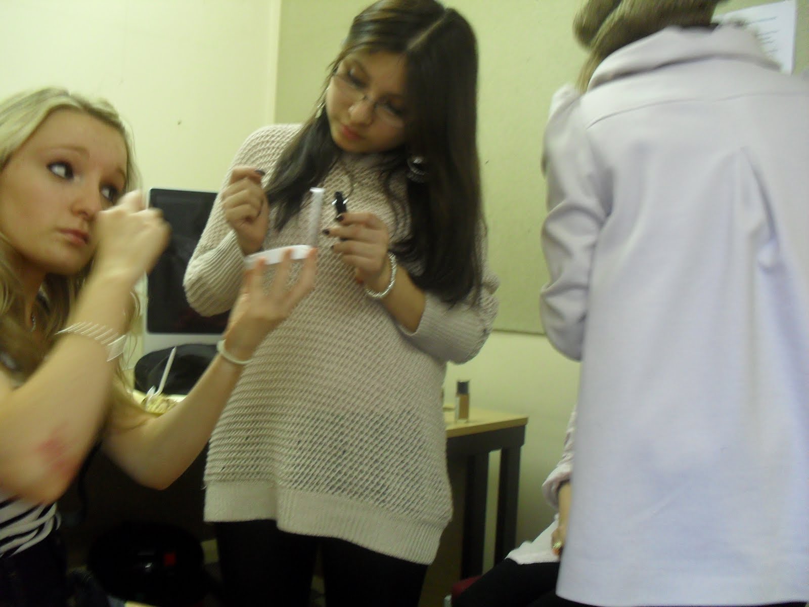
These images shows the interview preperation of the new duo - LA Girls


This image will be used on the contents page.


This image will be used as my front cover centre image


These images above will be used on the double page spread article page of the interview.

First Draft: Interview with the new duo LA Girls

How did you form your band?
Our band was form through secondary school where all our talents were found through music in our lessons which became the first bonding.

How did you all meet?
We both met in secondary school and since then we have been good friends through the year.

Why did you decide to become a duo rather than solo?
We didn’t want to be solo because we have been good friends since school. We thought that it would be fun and we began to upload videos of our covers on YouTube. We ended up getting really good feedbacks which had motivated us to the idea of actually giving it a try.

What inspired you to form the name of your duo [band name]?
It was literally a random thought from looking at previous examples such as Wire, Kerrang, so why not [band name]?

What type of audiences is your music aiming at with the lyrics?
We don’t particularly have an audience that we are aiming at really. It’s more for any audience because really nowadays no one really has a certain genre that they listen to and they may like our lyrics rather than our music. Everyone has their own opinions and our lyrics may relate to their past experiences or lifestyle.

What is your single trying to impersonate towards the audience?
It’s mainly about our past experience and the lifestyle that we were in. Also about the problems we had at home.

Who creates the lyrics? Do you write your own?
We both contribute to writing the lyrics and our songs. We both have ideas for the songs and try to create it as one.

Who is your inspiration towards the music and the writing?
Erm, Kings of Leon, Biffy Clryo, Bon Jovi, Lost Prophets.

How did the industry find you? Who is your manager?
We were found on YouTube. Our manager, John Stevenage commented us through their and had liked our videos and wrote us a message to contact him. We didn’t expect anymore, we just expected just the audience comments. We both knew that it was unsafe as we didn’t know much about agents and that but John is a real achiever and also manage other groups as well.

Do you have any upcoming events/tours or even releasing a new single?
We haven’t confirmed anything just yet but hopefully by this summer or the beginning of 2011 we will have an event to inspire other artists to follow their dreams and passion.

Who are your supporters?
We have many supporters behind us such as our families and friends, especially the fans who have our back all the way. It’s much appreciated and the amount of effort we put in is from the support of everyone so we thank everyone for keeping us on our toes and sending in your help.

How would you feel becoming no.1?
Anii: Becoming number one would be the best thing ever to happen for both me and Looiie, it would be the best thing in the world and I hope one day we would reach the hits with most of our records and become a big success in the future as the most known duo.

Looiie: And also with the support of everyone and I hope our music inspires everyone to listen and buy our records, it will be the most helpful and encouraging support for us to try even harder.

Is there any artist you would like to combine and have a duet with?
Looiie: I wouldn’t mind having a duet with B.o.B, he is such an awesome artist and it would be cool to mix both of our music or Paramore who I really like. Their music is not so strong of rock and the lyrics are cool as well.

Anii: I wouldn’t mind having a duet with Ke$ha, she’s funny and so realistic well in her world. Her music is written with no care which music should be, lyrics of your own thoughts without concerning others and just pure fun.

What is the biggest thing a fan has done to see you?
Erm, I don’t know actually there hasn’t been much damage except for the one time when we went for a record signing and whilst walking through the crowd there was this one young teen who looked about 17 and he tried to grab Looiie for her attention to take a picture with and the securities just went mental. So I guess that was one crazy moment that we would be aware of. The crazy fans these days would just do anything don’t they? Being famous is mad.

Where would you like to tour around?
We have heard that we would be touring around New Zealand and around America of course. There isn’t any specific place I would like to go because I want to travel everywhere but the most popular of all would be Tokyo and Korea, it would be awesome to play over there and show them the different type of music America has towards the Japanese and Koreans. Hopefully a duet maybe with one of their top artist would be great not to compete but to have fun and I’m sure they would like the same to come back to America and gain an experience. But other than that anywhere and everywhere.

Where were you brought up?
Anii: Well I was brought up in Brooklyn, “the slums” known for the new Yorkers, but it really isn’t as bad as people think and say it is, maybe a murder every once a month? I joke. Brooklyn is actually pretty quiet when it comes to the night time but just down the road of each high street it’s madness with the clubhouse all living it up.

Looiie: I was brought up in LA, I know “fancy”. But after I moved to the city for high school and college because my parents moved but I prefer living in LA with the weather always hot and the people there are friendly whereas in New York it is a bit different. I would love to live in Australia later on in life though because it is such a beautiful place and I want to experience the living there.

Has being famous become what you expected?
Being famous is worst than I thought, one you hit fame your reality is gone you can hardly do anything you want and live a real life. There are too many people watching every step you take and you have to watch out with crazy unexpected strangers or “fans” behind you which is why there has to always be a security beside you or least notice of where you’re going. It’s like living in a tight world always walking on eggshells.

Tuesday, 16 March 2010

Magazine Title blocks

Title 1


Title 2


Title 3


Title 4

Tuesday, 23 February 2010

Title Blocks Analysis


The style of the Rolling Stone title does not show any genre of the magazine as it’s written in a fancy handwriting so you wouldn’t think the title would be of a rock magazine but from the title you can tell that it could be a rock magazine as there is a rock band called the rolling stones and it could be related to the band type of music. The colour of the title is a basic single colour. The tone of the red is bright which makes the title stand out and appeal to readers but otherwise it does not show any other information about the magazine from the colours.
The rolling stone title shows that the magazine varies from music which are more of the olden type such as the rolling stones themselves and Bon Jovi, yet still introducing new artist. The title Rolling Stone, as it’s a rock genre magazine, can be taken from the rock band The Rolling Stones and be inspired by their music to create a magazine on behalf. The style of the magazine title is handwriting based and it looks like more of the old 90’s time, this created a target audience of readers between 16+ and who are into rock music.


The title of Q magazine is too basic and plain, it does not show any other but just a letter. It does not show any clue or images of what music genre it might be. The colours used are basic red and white and for someone who has never read or seen Q magazine, I would expect by viewing the title it would be a sports/men magazine as the title is written in a fancy style and because of the colours. The Q leaves readers asking questions if they saw the title. The font is hard to review about the magazine and the meanings to it as there are no other extras included, it gives a clueless idea of the magazine and the meaning behind it but the way the title is written the magazine could be reaching out to audiences ranging from 16+ because of the style of the font and colours used which changes the type of magazine it could be.


The KERRANG! title represent that it is a rock magazine because of the way the title is presented with an exclamation mark at the end that could represent the tone of music the magazine views. The colours used is just black written in big bold capital letters to represent an obvious magazine type to their readers and attract their attention as the title is in capitals and black. The title KERRANG appeals that it is just a random word which attracted the producers of the magazine that could be from rock stars would use and shout out to their fans. The title views that the target audience could be towards readers from young age of 13+ and those that are interested in rock music.

Friday, 12 February 2010

Double-page spread #2


The choice of band featured in the article is of a Hip Hop artist, GZA which represent the magazine as a hip hop genre therefore its targeted audience are towards readers who are interested in hip hop music.
The type of language used in the magazine is directly being told from GZA who is being interviewed by the magazine reporter, this includes slang and foul language – “IT’S FRUSTRATING SEEING RAPPERS TALKING ABOUT THE SAME SHIT ALL THE TIME, THERE’S SO MUCH TO WRITE ABOUT!” quoted directly from GZA.
The colours used in the article are mainly black and red. The use of red are features to represent the character such as the subtitle in the centre of the article. The colours are used as a Q&A style, red for the questions as the main interest and black for the answers.
The style of text is written in a formal layout and the text are direct speech. It also included dialog of GZA reaction – [chuckles].
The layout of the article is separated with a full page image of the artist GZA on the left page and the article on the right page with the heading pointed big and bold in red at the centre of the page.
The images and text has a page on its own for their features.
The tone of the magazine when addressing the reader is as though they are talking directly to them as the journalist as the article is laid out as an interview.
The image is showing a full length picture of GZA with the “ghetto” look and relaxed. The audience would see the image as a hip hop street style artist by the clothes GZA is wearing as it’s basic and plain with just jeans and a plain white t-shirt, so the style is simple.
The style of the article and the image of the front cover match well as the use of colour and the font text are similar and also used on the cover of the magazine such as the title.
The article does not demand a high status of knowledge about the artist itself as he has been introduced briefly at the beginning of the article. “He’s rated possibly the best emcee which most would consider to be the greatest rap group of all time”.

Double-page spread #1 KERRANG


The choice of band in the article above is of My Chemical Romance who are a rock band therefore the target audience the magazine is reaching out to are for those that are interested in rock music. This is suggested by the genre of the band itself and the type of magazine the news is featured in as Kerrang is a rock magazine.
The language of the article is written in a formal presentation of an interview, there are no specific style of wording or phrases but a written interview with MCR.
The colours used in the article are just red, black and white which represent the neutral rock colours. The black and white photographic background creates a reality in the music studio of MCR recording which represent real passion and success about the rock band. The Red titles and speech such as “NEWS World exclusive” brings a leading start to the heading “WE’RE BEING THE BEST MCR WE CAN BE”. With these text written in capitals and bold, it attracts immediate attention to the article for the readers to look into it. The read sub-headings bring attraction as it’s one of the thing that will stand out of the page.
The style of the text such as the big bold title introducing the article creates a direct speech to the readers, viewing about themselves (MCR). The style of the article is written in two columns which present the article in a well organised prospective and easy to read.
The double-page spread is laid out with one page a photograph of the leading singer performing with the title NEWS in bold, red writing on the top left corner. This can catch the readers’ attention to read about them and find out the news that’s being revealed. On the other page presents the titles in big capitals rock theme fonts which represent MCR genre. There are also images of the band on the bottom of the page with the short article in the centre of the page above the images. The layout of the article with the text placed in the centre of the page creates a centre of attention feature to the news which allows easy access for readers to read.
The image included in the article mostly covers the double pages with the short article placed only in a small section in the middle of 1 page. There are not much text written on the pages about MCR but there’s a side bar on the right hand sand where listings of their new tracks from MCR are revealed and reviews from listeners are told.
The sort of language that’s used in the article is being told as a member of an “in crowd”, as though it’s speaking to viewers as a news reader and not a friendly approach with interviews included.
The images of the band are presented as a hard-working successful group as it shows the rock stars in recording process.
The article in the magazine matches the front cover because they have similar text font and colour, also similar fonts has also been used for some of the article text. It also introduces the magazine Kerrang in its title which is what the magazine being issued is.
The article does not need a high demand of knowledge about the band to understand the article as it introduces the characters: “My Chemical Romance, Gerard Way”. It also includes many quotations from the interview. “Our original game plan was to make a quick visceral record” which was reviews by the Kerrang crew; this involves reader into the article as it’s mainly writing about the characters in the band and not needing specific known knowledge for readers to include while reading the article.

Thursday, 11 February 2010

Magazine Content page #2


The content page is from CLASH music magazine. It shows a full length image of an artist from a popular rock band called the Foo Fighters. It shows his character as the main image as they are news of the day in the magazine. It also presents few other images on the left side of the page who are featured in the magazine.
The style of the magazine is view in the centre bottom middle of the page with listings of what the magazine includes with headlines from Features, Ones to watch, Fashion and regulars. It’s a well presented content as it’s laid out in front of you under each page guide which makes it easier for readers to know what they are reading about. The presentation makes the magazine view as an indie magazine because of the colours and the information it shows with the artist.
The colours used are basic with mainly white writing with a blue background. It creates a melody feeling to the readers as the blue background isn’t so violent but a calm midnight blue. The colour used does not attract immediate attention to an alert topic but the image of the artist brings attention on what the image represents and the story behind it.
There are promotions or advertisement of orders which readers might be interested in to receive such as their fashion.